Uppercase Magazine

20140722-194412.jpg
Oh the excitment !

I've been a fan of Uppercase magazine for quite a long time. Yes, its expensive, whether you buy loose copies or subscribe direct, but it is beautifully curated and visually delicious – no matter what the theme. I used to buy the magazine by issue at a local bookshop, but what really helps the magazine to survive and thrive is the subscriber base. And so after I heard Janine Vangool, creator of the magazine, give a talk at Hello Etsy in the Netherlands I just had to subscribe.

If you'd like to hear her , then here is a link. (I couldn’t link directly to her speech – this takes you to the collection of various Etsy videos – you are looking for Hello Etsy 2012 )
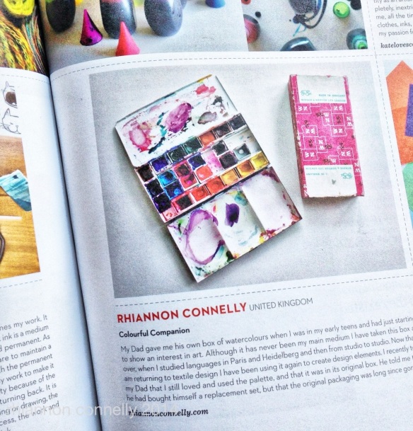
20140723-105918.jpg

So fast forward another little while and I happened to spot that one of the requests for submissions was based on “What colour means to you” – in whichever way that could be interpreted. I couldn’t resist sending something in – and hurray – it was accepted. So if you have a copy of issue 22 see if you can find my little snippet.

To whet your appetite, or introduce you if you haven’t come across Uppercase before, here is a trailer for this issue. If you want to subscribe you can do so here and hopefully the little secret code “roygbiv” is still current and will give you a $15 discount.


**************

I am cooking up some changes and new things at StarryBlueSky / Rhiannon Connelly over the next while – if you’d like to make sure you are in the loop then I’d invite you to subscribe to my studio newsletter – you can do that here , or at the top of the sidebar on the right.

January Colours

queensferry winter
I’m joining in the latest of Stephanie Levy’s online courses – this one has a seasonal flavour. And this week she encouraged us to take a walk around our neighbourhood paying particular attention to colour. Well, I am always walking and snapping, looking at colour and pattern . But it is interesting that when you really focus on one element the subtle differences seem even more pronounced. I was surprised how many variations I could even find amongst the brown shades ( a colour that I have been known to call “not a colour” ). Luckily the day I picked for this was one of those crisp bright winter days. Others have been posting lovely snowy images but if it had been white here there is no way I would have managed this route as there is a steep hill at both ends of the town.

IMG_9341

IMG_9340

IMG_9339

Also, wee reminder that there are only two more days to pick up a bargain at my Etsy shop before I close the doors. I will be discontinuing a lot of that range in their current format – although some images will find their way over to my other shop at www.rhiannonconnelly.com A few people have been asking me more about why I’ve decided to do that , so will address that in the next post.

IMG_9342

IMG_9344

IMG_9345

IMG_9343

Brightening up December

20131203-155359.jpg
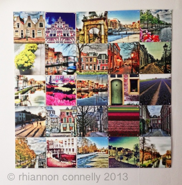
Now that it is December and there is precious little left in the garden ( although I am impressed by the few hardy plants that are still flowering ) I thought it was a good time to finally hang up the second Ixxi that I had made while I was in Holland.

I showed the other one I made a while back – which was of pictures from a “Leiden Year”. This second one is of flower images taken throughout a year. As with a lot of things that you leave for a while and come back to , there are changes that you would make second time around, but I still enjoy the reminder of all these flowers that have crossed my path. Some were taken out and about in Holland , others on my favourite Scottish windowsill and yet others are wildflowers from the meadows of Transylvania.

Even if you don’t live in the Netherlands you can use Ixxi to create a design for you, or you can also select something from their own collection.

If you’d like to know a bit more about the “behind the scenes” and get tipped off about my regular subscriber bonus you can make sure you get the studio newsletter by subscribing here . There should be one coming along quite soon.

20131203-155611.jpg

Ta-Da – The Cushions Have Landed

IMG_5098

Really “chuffed” as they say here, that my cushions are finally ready to put out in the world ! It has been great fun working on the designs and all the other elements. I hope you’ll like them too !

The cushions are available from the “shop” section of my own website and for 48 hours I’m offering free shipping – world wide for the cushion covers and for the UK covers plus pads as well.

IMG_5081

IMG_5183

IMG_5089

IMG_5154

IMG_5065

Book Review – Colour Deconstructed by Tricia Guild

Tricia Guild book

During Meet The Blogger in Amsterdam we also took a trip along the canals to the Designer’s Guild show room in Amsterdam. It was a chance to buy a copy of Tricia Guild’s latest book “Colour Deconstructed” and have it signed as well. They only had the Dutch versions available but actually language isn’t really an issue in this book – colour plays by far the biggest part.

The images include some of the ones that Tricia Guild used in her presentation and started with black and white. She said that she is normally more associated with bright colours but in her opinion black and white can make just as much of a statement.
black and white

I can see that the book is going to become one of my “go to “resources when I want to look for some fresh colour combinations. There are pictures from nature or striking colours spotted on her travels mixed in with how she has interpreted these colours in houses around the world. Definitely a book to look through on an autumn day with a nice cappucino in hand.
purples

This mix of greens yellows and aquas is always a favourite for me.

green aqua

**********
And behind the scenes nearly ready to launch my own range of cushions – very exciting to see them go out into the world at last. Would you like to make sure you stay in the loop about new designs and other creative snippets ? Make sure you subscribe to my studio newsletter here.

Annie Sloan Chalk Paint – Review and Thoughts

IMG_6252

I needed to paint a few props to use in my cushion photo shoot ( wee preview above ). Fortunately I also had a few wooden pieces just “lying around” waiting for such an opportunity. I tried to find the old “Paint Magic” paints, but they are not made anymore and then discovered Annie Sloan Chalk paints.

IMG_5051

Not wanting to take on a chair as a first project I painted up a little wooden step stool from Ikea. I painted it in two layers, blue then orange on top, sanded it down to give it a distressed look. ( I rubbed candle wax on the edges, but I’m not sure that this is necessary with this paint.) And finally I finished it with the soft wax that is part of the range. Although a small item, it did take a reasonable amount of time to do the painting and the wax requires a bit of elbow grease to get a nice sheen. This finishing stage can be done with either wax or varnish – I opted for the wax and one nice thing about using wax is that you can either only buff it to just a slight sheen or with a bit more vigour get a shinier finish. Either way the result is very nice to the touch.

IMG_5054

There is a bit of debate about whether to sand before or after the waxing. With this one I chose to sand before the waxing – it is a bit dustier, but as I had used the candle it seemed to make sense. I took the piece outside my studio to do it, so it didn’t make too much of a mess and the layers showed through just as I wanted.

Next up the first chair. I gave it an initial coat and it dried to a lovely velvety finish with all brush marks fading away. However, then I thought I should sand it and this made it rather uneven and scratchy. I gave it another coat in the worst affected areas but this did not really resolve the issue. Finally I applied the wax and buffed it. The final result, because of the sanding and retouching is quite weathered and aged which I quite like now, but it is not the even finish I was aiming for.

So, it seems from this that if you want a flattish finish and are not doing distressing then you don’t need to sand ?

That is the way I treated the next chair. Coat of paint followed by wax. The finish is nice and pretty even but actually, I think I prefer the slightly textured look of the first chair. Oh how fickle !

Last conclusions from this round of painting is that the paint really comes into its own when used for various distressing techniques, even if it is just tone on tone. There is a darker wax that can also be used to give a different aged look , but I haven’t had a go with that yet.

Once I have finished the photo shoot with the cushions I will tackle my next project which is the low table in my studio. This dark wooden piece had its surface ruined after an accident with a vase so its time to give it a colourful new lease of life.

The website above will point you in the direction of stockists for the paint and if you are in Edinburgh you can get it at the Laurel Gallery in Stockbridge.

Studio Tidying – Finding Snippets from a Kaffe Fassett workshop.

patchwork
The other day I spent a couple of hours sorting through a few more boxes in my studio. I thought I’d gone through everything but it turns out there were still a couple of boxes that never got a once over after the move to Queensferry.
In one of them I found a notebook where I had jotted down some thoughts after doing a Kaffe Fassett patchwork workshop in Sweden.

Here’s what I had to say –

” I feel like my head is full of colour. What did I learn ? To let big patterns swirl into small ones. To let colours build up and fall away. To put in a “rogue” colour to make it more lively. Sometimes it can be good to put just a tiny bit of check or stripe in with florals. If a colour is too jarring draw on it with fabric paints.”

Although this was intended for patchwork I think it could apply to a lot of other things too. The other thing I’d noted down was Kaffe’s advice ( paraphrased I think) not buy rubbish but to spend our money on colours. Good advice in my book !

Shockingly I never finished the stitching up of this project as at that time my sewing machine was in storage. I have fished it back out and will save it as a project for some rainy days in winter. It is going to need a bit of untangling but I have got the complete middle line so that will help me piece any other bits back together again. I wish I could just snap my fingers and it would be done !

Even if you are not particularly experienced in patchwork I can recommend their workshops ( and I’m guessing the same also applies to the knitting ones,but I haven’t done one of those ) as an inspiring day filled with colour and ideas. You can see where the next ones will be on their website – looks like the next ones will be in the US and Canada, with Australia following in 2014.

August Break Day 22 – Instagram Fun

ranunculus

A while ago I submitted a few Instagram pictures to a contest that the Dutch interior magazine 101 Woonideen were holding. The idea was to send pictures that showed colour in the home. I was delighted to see that one of them was chosen and here you can see it featured in the magazine. It’s a favourite magazine of mine , so that was a lovely surprise.

IMG_5830

IMG_5832

And just a wee tip off – I know my birthday is on Sunday, but since that is not a great day for online goings on I am holding my annual 50% off day on Friday ( tomorrow). Although I do a few different offers over a year I only ever do the 50% off day once – the offer will run for 24 hours. To take advantage of it use the code HAPPYDAY – please let me know if you have any problems with it.

All Roads Lead to Leiden

20130703-145022.jpg

Oh the Internet is a funny and tangled place. A day or so ago Ama an Etsy friend from Leiden posted a picture that a local blogger, Louise, had taken of her market stand during one of Leiden’s many festive weekends. Of course, I had to pop over to the blog to read the review and reminisce over attending the same event last summer. On reading a bit further I discovered that the same blogger had just been featured by Tina,a London blogging friend who has a regular challenge post. And the challenge this time was for each of them to make a video about their respective towns, Leiden and London. So hop over here to see both of their videos.

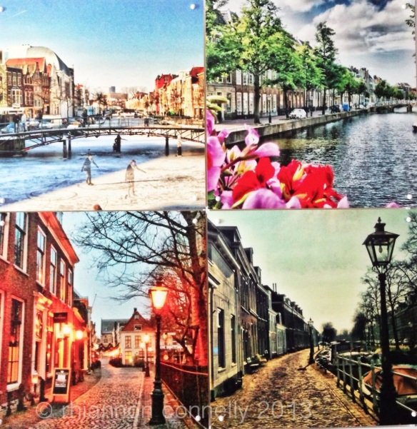
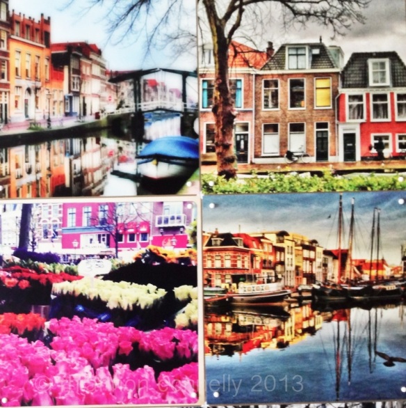
In the meantime I have finally felt like piecing together this Ixxi that I designed with images from ” A Leiden Year”. I know it sounds a bit soppy, but I felt too sad about the end of the Dutch adventure to pin it up before now. It really felt that I was reconnecting to a part of my heritage again , only to see it come to a halt. Well, there are good sides to every change, of course, but I do plan to hang on to those strengthened Dutch ties with more regular visits – and with a bit of luck there will be another period over there in the future.

20130703-145051.jpg

20130703-145115.jpg

Colour palette – Yellow and Orange

20130702-154613.jpg

I admit I was looking forward to a bit of a blogging break after my 30 days. And just that little bit of time off has let me simmer through my feelings about the experience .

I don’t think I will manage a 5 a week routine but I’ll be aiming for three weekday posts . I also want to add even more colour . I enjoyed doing the posts that contained a whole photo series so I plan some more of those .

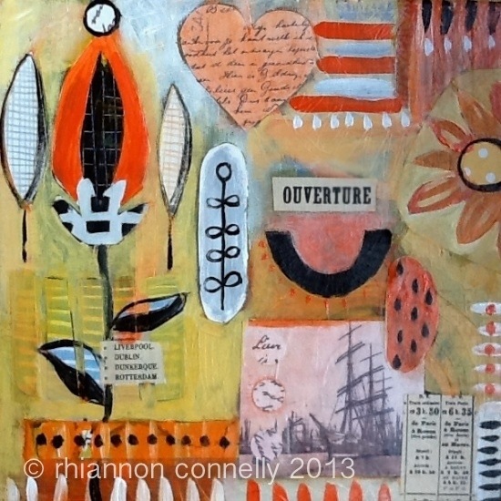
So I’m back again today with some colour . I’ve been doing a course and as part if this we were assigned particular colour combinations . Mine were yellow and orange . Individually I like both of these , but together it was quite a struggle . Still , I pushed on , and in the end was quite happy with how they turned out . ( I did 4 pieces – this is my favourite one ). I know that without the structure of the course I would have abandoned these far sooner. The process was some painted layers , some collage and then quite a lot more paint on top .

I plan to tackle some of the other colour combinations over the next few weeks – either in photo or paint form – especially the ones I’m not really drawn to .

By the way – my http://www.rhiannonconnelly .com website is down at the moment – I hope to have it back up by the end if the week . I’ve switched company and it hasn’t been as smooth as I’d have liked .